Are you struggling to make your adult products pop in a sea of sameness? It’s tough when every box starts to look alike, and your unique brand message gets lost. You need packaging that not only protects but also powerfully projects your brand’s identity and value.
The right packaging design is absolutely crucial for differentiating your adult product brand. It’s your first handshake with the customer, conveying quality, trustworthiness, and your unique selling proposition before they even touch the product. Effective packaging can transform perception and drive purchasing decisions, making your brand memorable.
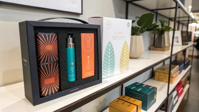
Getting your packaging right is a game-changer, seriously. It’s more than just a box; it’s a silent salesperson, a brand ambassador, and a promise to your customer. I’ve seen firsthand how thoughtful packaging can elevate a product from just another item to a must-have experience. So, let’s dive into how you can leverage design to make your mark. We’re going to explore some key areas that can really make a difference.
How Can Your Packaging Balance Discretion with Desire in the Adult Market?
Feeling stuck between wanting sleek, desirable packaging and needing to offer absolute discretion? It’s a common headache in our industry. Customers want to feel excited by their purchase, but also safe and private. Striking that perfect balance can feel like walking a tightrope, right?
Your packaging can achieve both discretion and desire by using elegant, minimalist outer layers for privacy, combined with an inner reveal that showcases the product’s allure. Think sophisticated, unmarked shipping boxes, with beautifully designed, brand-expressive primary packaging inside. This layered approach respects privacy while still delivering a premium unboxing experience.
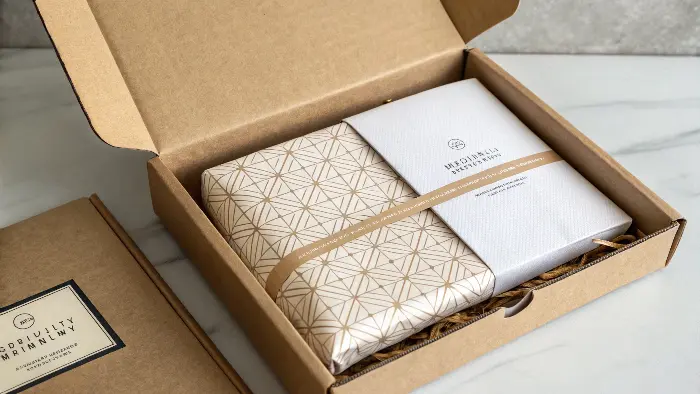
Finding that sweet spot between discretion and desire is something we at PrivyPlay think about a lot. It’s not just about a plain brown box anymore – though that’s still a must for shipping for many brands. The real magic happens with the primary product packaging. I remember one project where we were developing a new line. The client wanted something that screamed luxury but could sit on a nightstand without screaming "adult toy!" We opted for a matte black box with a very subtle, debossed pattern – almost like a high-end tech product. Inside, though, the product was nestled in silk, and there was a small, artful insert that hinted at the pleasure within. It’s about creating an experience. The outer layer says "this is private, this is for you," and the inner layer says "this is special, this is an indulgence." You can use abstract designs, sophisticated color palettes, and minimal text on the outside. Then, the unboxing itself becomes part of the allure. Maybe it’s a magnetic closure, a ribbon pull, or a beautifully printed interior. It’s these little touches that make the customer feel valued and understood. We’ve found that customers appreciate when a brand respects their privacy without treating the product like something to be hidden in shame. It’s a fine line, but getting it right builds incredible trust.
Here’s a quick look at how different elements can contribute:
| Feature | Discretion Aspect | Desire Aspect |
|---|---|---|
| Outer Shipping | Plain, unbranded box/mailer | N/A (focus is purely on privacy) |
| Primary Box | Minimal branding, abstract design | Premium materials, tactile finishes |
| Inner Reveal | Secure, product not immediately visible | Luxurious lining, artful presentation |
| Branding | Subtle logo, sophisticated typography | Evocative imagery (if used), color psychology |
| Messaging | Focus on wellness, empowerment | Hints at pleasure, sensory experience |
This approach ensures that from the moment the package arrives to the final reveal, the customer feels both secure and excited. It’s about understanding the customer journey and designing for each step.
What Packaging Materials and Finishes Truly Elevate Your Adult Product’s Perceived Value?
Ever picked up a product and just felt its quality before even seeing what’s inside? That’s the power of materials and finishes. If your packaging feels cheap or flimsy, it can instantly devalue even the most amazing product. You want customers to feel they’ve invested in something truly special, right?
Premium materials like rigid board, soft-touch laminates, and unique textures, combined with finishes such as embossing, debossing, foil stamping, or spot UV, significantly elevate an adult product’s perceived value. These elements create a tactile and visual experience that screams luxury, quality, and attention to detail, justifying a higher price point.
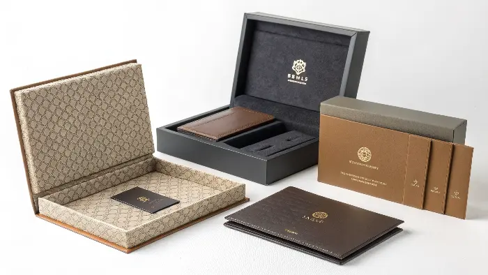
When we talk about "Elevating Pleasure, Empowering Confidence" at PrivyPlay, we believe that experience starts with the packaging. The choice of materials is huge here. Think about the difference between a thin, glossy cardstock and a thick, matte-finished rigid box. The latter just feels more substantial, more luxurious. I’ve seen brands transform their market position simply by upgrading their packaging stock. Soft-touch lamination is a personal favorite of mine; it gives this velvety feel that’s incredibly inviting. Then you have finishes. Oh, the finishes! Embossing or debossing a logo or pattern adds a tactile dimension that’s really sophisticated. Foil stamping – whether it’s gold, silver, rose gold, or even a holographic foil – can add a touch of opulence or modernity, depending on how it’s used. Spot UV is great for making certain elements pop, like your brand name or a specific design feature, by giving it a high-gloss finish against a matte background. It’s all about creating contrast and interest. We once worked on a high-end vibrator packaging, and we used a combination of a deep, rich color, a soft-touch finish, and a single, elegantly debossed brand mark. The feedback was incredible – customers felt like they were unboxing a piece of jewelry. Don’t underestimate the psychological impact of these choices. They communicate that you care about every detail, and that translates to the product itself. It’s an investment, for sure, but the return in brand perception and customer satisfaction is well worth it.
Consider these options:
| Material/Finish | Sensory Impact | Brand Message Conveyed | Common Use Cases |
|---|---|---|---|
| Rigid Board | Sturdy, substantial, protective | Luxury, durability, quality | High-end toys, gift sets |
| Soft-Touch Laminate | Velvety, smooth, inviting | Premium, sophisticated, gentle | Primary boxes, sleeves |
| Textured Papers | Unique, tactile, organic/modern | Craftsmanship, uniqueness | Inserts, wraps, specialty packaging |
| Embossing/Debossing | Raised/recessed design, subtle | Elegance, attention to detail | Logos, patterns, text accents |
| Foil Stamping | Metallic sheen, reflective | Opulence, modernity, highlight | Brand names, key design elements |
| Spot UV Varnish | Glossy highlight on matte | Contrast, focus, premium feel | Logos, images, specific text areas |
Choosing the right combination can really make your product feel like a premium gift, even if it’s a gift to oneself. It’s about making that first touchpoint an unforgettable one.
How Can Your Packaging Design Clearly Communicate Your Brand’s Unique Story and Values?
Is your packaging just a container, or is it telling your brand’s story? If customers can’t quickly grasp what your brand stands for – be it empowerment, luxury, playfulness, or wellness – you’re missing a huge opportunity. Your packaging should be a mini-billboard for your brand’s soul.
Your packaging design communicates your brand’s unique story and values through a cohesive blend of color psychology, typography, imagery (or lack thereof), material choices, and messaging. Every element should work together to instantly convey your brand’s personality, mission, and what makes you different in the adult product landscape.
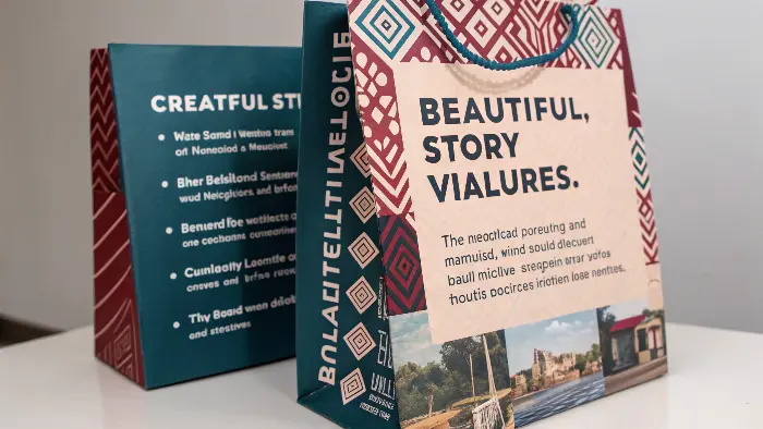
This is where the heart of your brand comes alive on the outside. At PrivyPlay, our slogan is "Elevating Pleasure, Empowering Confidence," and we try to weave that into our design thinking. If your brand is all about natural wellness, your packaging might use earthy tones, recycled materials, and botanical illustrations. If you’re a luxury brand, it’s deep jewel tones or classic monochromes, premium textures, and minimalist, elegant typography. A playful, adventurous brand? Bright colors, quirky illustrations, and maybe even some interactive elements. I remember working with a startup that was all about sexual empowerment and education. Their packaging used bold, confident typography, vibrant colors that challenged traditional "feminine" palettes, and concise, empowering statements right on the box. It instantly set them apart from more demure or overly clinical brands. Your logo, your color palette, the style of any imagery or patterns, the very words you choose to put on the box – they all need to sing the same song. It’s about consistency. If your website is minimalist and modern, but your packaging is ornate and traditional, there’s a disconnect. Think about your target audience. What resonates with them? What story do they want to be a part of when they buy your product? Your packaging is your chance to invite them into that story. It’s not just about looking good; it’s about connecting on an emotional level.
Here’s how different elements can tell your story:
| Design Element | Potential Story/Value Communication | Example Brand Archetype |
|---|---|---|
| Color Palette | Earthy tones: Natural, organic. Brights: Playful, energetic. Monochromes: Sophisticated, modern. Pastels: Gentle, romantic. | The Innocent / The Jester / The Ruler / The Lover |
| Typography | Serif fonts: Traditional, trustworthy. Sans-serif: Modern, clean. Script fonts: Elegant, personal. Bold fonts: Confident, strong. | The Sage / The Everyman / The Creator / The Hero |
| Imagery/Iconography | Abstract patterns: Intrigue, art. Minimalist icons: Simplicity, function. No imagery: Focus on product/discretion. | The Magician / The Caregiver / The Explorer |
| Material Choice | Recycled/Kraft: Eco-conscious, authentic. Rigid/Velvet: Luxury, indulgence. | The Innocent / The Ruler |
| Copy/Tone of Voice | Empowering, direct: Confident, bold. Gentle, suggestive: Romantic, sensual. Humorous: Playful, lighthearted. | The Hero / The Lover / The Jester |
When all these elements align, your packaging becomes a powerful testament to your brand’s identity, making it instantly recognizable and relatable to your ideal customer. It’s like, they get you before they even open the box.
Can Eco-Friendly Packaging Choices Actually Make Your Adult Brand More Desirable?
Thinking about sustainable packaging but worried it might not feel "premium" enough or might be too costly? Many brands face this dilemma. But what if going green could actually be a massive plus for your brand image and appeal, especially in today’s conscious consumer market?
Yes, eco-friendly packaging choices can significantly enhance your adult brand’s desirability. Consumers, especially in wellness-adjacent markets, increasingly value sustainability. Using recycled, recyclable, biodegradable, or reusable materials signals responsibility and care, aligning your brand with modern values and attracting environmentally conscious customers, often justifying a premium perception.
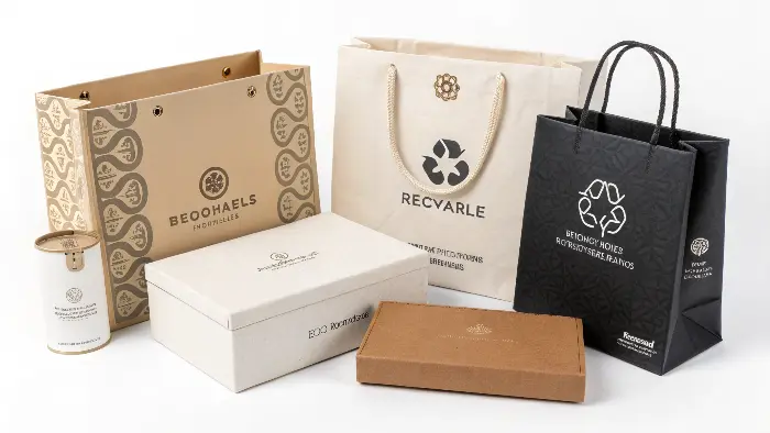
This is a big one for us, and I think for the industry as a whole. There used to be a perception that "eco-friendly" meant "boring" or "cheap-looking." That’s just not true anymore! Some of the most innovative and beautiful packaging solutions I’ve seen lately are sustainable. Think about materials like FSC-certified paper and card, soy-based inks, biodegradable plastics (like PLA derived from cornstarch), or even mushroom packaging! It’s not just about ticking a box; it’s about genuinely reducing your environmental impact, and customers notice. I was talking to a brand owner recently who switched to fully recyclable packaging and made a point of highlighting it in their marketing. They saw a noticeable uptick in positive customer feedback and even attracted a new segment of eco-conscious buyers. It becomes part of your brand story – "we care about your pleasure, and we care about the planet." This resonates deeply. Plus, clever design can make sustainable materials look incredibly chic. Kraft paper can be dressed up with elegant typography or a single, impactful color print. Glass, while heavier, is infinitely recyclable and feels premium. Some brands are even designing packaging that’s intended to be repurposed – a beautiful box that can be used for storage, for example. This adds value beyond the initial unboxing. The key is to be authentic about it. Don’t just greenwash; genuinely invest in better solutions and be transparent with your customers about your choices and your journey. It builds trust and loyalty, and in a market focused on personal well-being, planetary well-being is a natural extension.
Here’s a breakdown of some eco-friendly options and their appeal:
| Material/Approach | Environmental Benefit | Brand Appeal Enhancement | Considerations |
|---|---|---|---|
| Recycled Content Paper/Card | Reduces virgin material use, landfill | Shows commitment to circular economy, often has a natural look | Print quality, sourcing consistency |
| FSC-Certified Paper | Responsibly sourced from managed forests | Demonstrates ethical sourcing, supports forest conservation | Slightly higher cost |
| Soy/Vegetable-Based Inks | Lower VOCs, biodegradable | Safer for environment and workers, natural appeal | Color vibrancy might vary slightly |
| Biodegradable Plastics (PLA) | Breaks down under specific conditions | Innovative, reduces plastic pollution (if properly disposed) | Requires industrial composting |
| Minimalist Design | Less material used, less waste | Modern, efficient, focuses on product | May not suit all brand aesthetics |
| Reusable Packaging | Extends life of packaging, reduces waste | Adds value, encourages brand interaction post-purchase | Design for durability and appeal |
Honestly, making sustainable choices isn’t just good for the planet; it’s increasingly good for business. It shows you’re a forward-thinking brand that aligns with the values of a growing number of consumers. And that, my friends, is a powerful differentiator. 🔥
Conclusion
So, what’s the takeaway? Your packaging is way more than just a box. It’s your brand’s first impression, a storyteller, and a key differentiator. By thoughtfully considering discretion, materials, brand narrative, and sustainability, you can create packaging that not only protects your product but also captivates your customers and builds lasting loyalty.
